
Damion Smy
Record fuel prices spark gouging probe as government threatens crackdown
2 Hours Ago
Citroen's new logo might seem to be a radical break with the past, but it's actually a return to the company's origins.

Journalist

Journalist
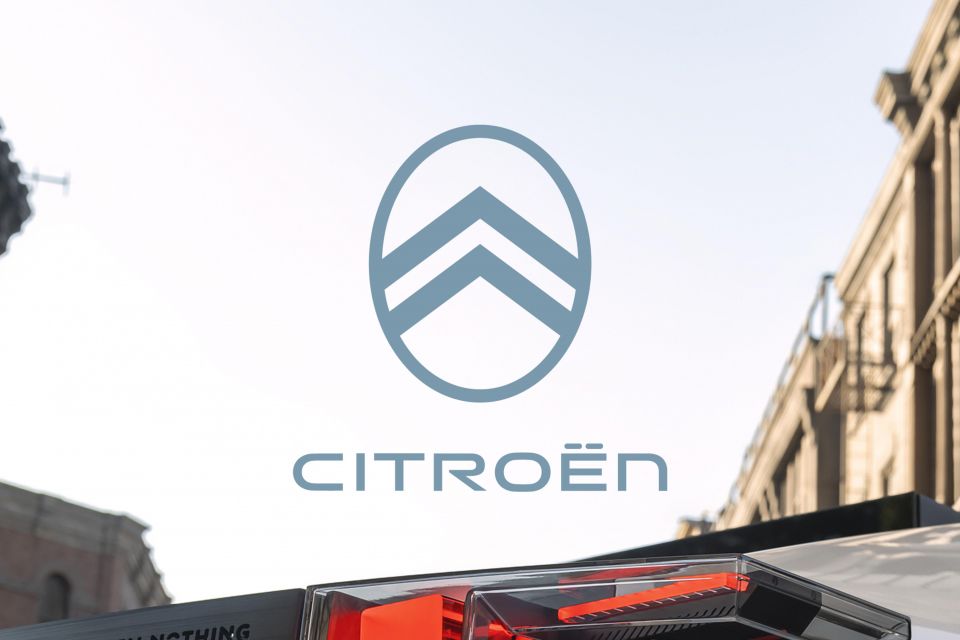
Citroen has unveiled a new logo, which is actually a remix of the company’s original badge.
As is the trend with recent brand reimaginings, the new Citroen logo is flat for advertising and print material, while the car badges are a little more three-dimensional thanks to their 3D printer-style design. Gone is the pronounced metal finish of the current badge.
Stylistically the new logo is most similar to the original design used when Andre Citroen launched the automaker in 1919. With updates throughout the years, it was the company’s primary logo between 1919 and 1959.
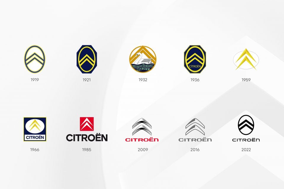
The company’s famous “deux chevrons” were designed to celebrate the success of Andre Citroen’s earlier metalworking firm, which made chevron-shaped ‘herringbone’ gear systems.
In the new design, thin double chevrons live within a vertical ellipse. This means the company’s current grille design, which features chrome bars extending out from the chevrons, is living on borrowed time.
The automaker says it will debut the new badge on a concept car that will be unveiled before the end of the month.
Accompanying the new badge are a new word mark, and a new slogan: Nothing Moves Us Like Citroen.
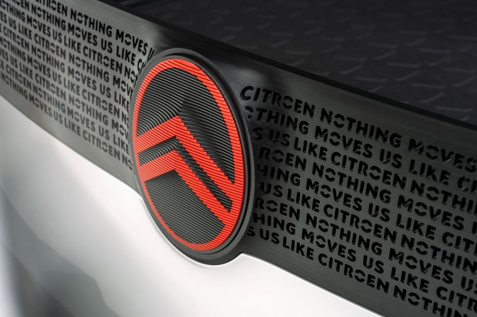
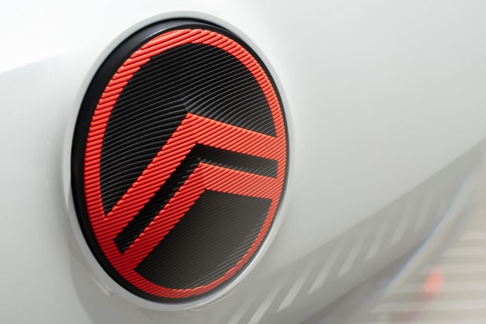
In an image released overnight, which we presume previews the upcoming concept car, the badge is finished in red and made of up of prominent horizontal stripes.
At the front it’s mounted on a clear white space, while at the back it lives within a black plastic garnish strip with the company’s slogan cut into it.
Production vehicles are expected to adopt the new logo from the middle of 2023.
CEO Vincent Cobée says the retro badge is an “elegant symbol of progress” as the brand prepares to field an all electric vehicle lineup in Europe by 2030.
Two years on from the merger of the PSA Group and Fiat Chrysler to form Stellantis, the French-Italian-American automaker has already unveiled completely redesigned logos for its Peugeot and Dodge brands.
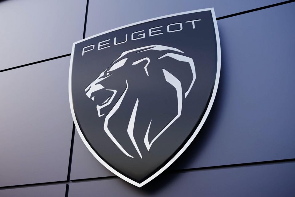

With CEO Carlos Tavares giving each one of the company’s 12 marques 10 years of funding, underperforming brands, such as Lancia and DS, may also receive updated identities.
Outside of Stellantis, Kia launched a radically redesigned logo at the beginning of 2021, while Skoda’s recent Vision 7S concept debuted the brand’s new typographic logo that replaces its long-lived flying arrow badge.
More subtle brand refreshes have also been launched in recent years by Volkswagen and Nissan.
MORE: Stellantis — Everything you need to know about the new automaker
Derek Fung would love to tell you about his multiple degrees, but he's too busy writing up some news right now. In his spare time Derek loves chasing automotive rabbits down the hole. Based in New York, New York, Derek loves to travel and is very much a window not an aisle person.


Damion Smy
2 Hours Ago


Damion Smy
3 Hours Ago

Damion Smy
6 Hours Ago


Ben Zachariah
7 Hours Ago

Damion Smy
7 Hours Ago


William Stopford
8 Hours Ago
Add CarExpert as a Preferred Source on Google so your search results prioritise writing by actual experts, not AI.