
CarExpert
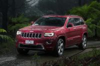
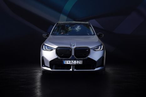
2026 CarExpert Choice winner: Best Luxury Mid-Size SUV
Distinctive styling inside and out, standout technology and classic BMW dynamic excellence make the X3 a winner.
49 Minutes Ago
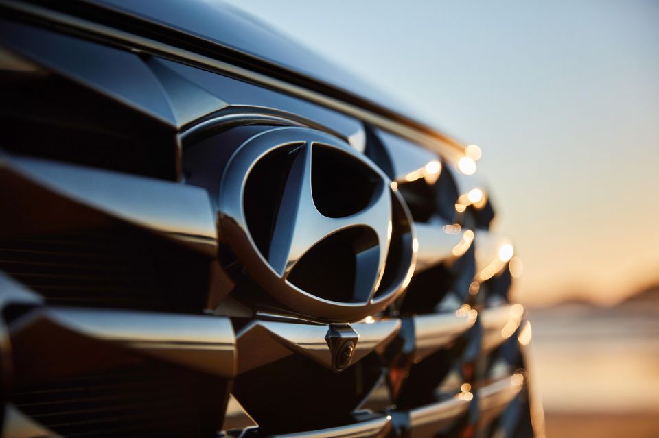
Out of all the brands currently available on the market, it's arguably the Koreans that have made the greatest leap forward in the last 20 years. Here’s what their badges mean.

Contributor
Contributor
Hyundai, Genesis, Kia and SsangYong are all ambitious brands, particularly with their electrification plans.
Korean vehicles today, from the Hyundai Staria and Ioniq 5 to the Kia Stinger and the Genesis GV70, are at the forefront of design and engineering. This shows just how far the Korean brands have come over the past few decades.
The badges of each of these Korean marques also symbolise the aspirations of these brands.
Genesis is Hyundai’s luxury brand, much like Lexus is to Toyota, and first came to prominence not through the splashy launch of the brand as a whole, but through the launch of a specific model, the original 2008 Hyundai Genesis sedan.
Interestingly, in the US market, buyers of this car were given a choice between having the traditional Hyundai ‘H’ emblem at the front of the vehicle or a Genesis specific design, and a substantial portion of buyers opted for the latter.
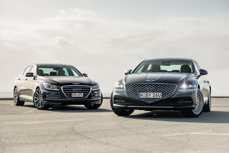
This form of practical market research may have been an instrumental reason why Hyundai decided to eventually relaunch Genesis as its own brand towards the end of 2015, with the Genesis brand officially launching here in 2019. The first-generation G80 was initially sold here as a Hyundai, though while it used the Genesis logo for everything from the bonnet to the puddle lights, it still wore the Hyundai logo on its boot lid.
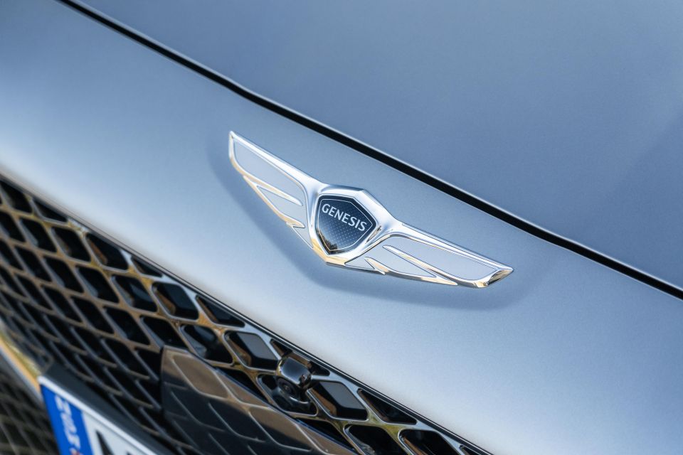
Since its inception, the Genesis emblem has featured wide, outstretched wings and a centred Genesis wordmark, not unlike British brands such as Bentley and Aston Martin, or American brand Chrysler. Indeed, Genesis itself provides a more subtle hint towards this, in saying that elements of the original design of the emblem, such as their metal-like colour, are inspired directly by the large amounts of chrome used in luxury cars.
More recently the Genesis emblem has been modernised and simplified into a flat, two-dimensional design.
Genesis designers say the logo has directly influenced the front-end styling of their latest products. The crest-shaped grille resembles the crest of the logo, while the split-level headlights are said to resemble the wings.
In English, the word Hyundai translates roughly to modernity, and it’s perhaps with this in mind that the company initially used a futuristic font for its first emblem in the late 1960s. Consisting of the letters ‘H’ and ‘D’ (these being the starting letters of the two syllables in the word ‘Hyundai’), the initial Hyundai emblem featured these in an italicised font, connected with a black outline almost in the shape of a car window, that was in turn surrounded by a circle.
This design lasted until the late 70s, before a simpler design featuring the HD letters and the company’s name spelled out in Korean was used during the 1980s.
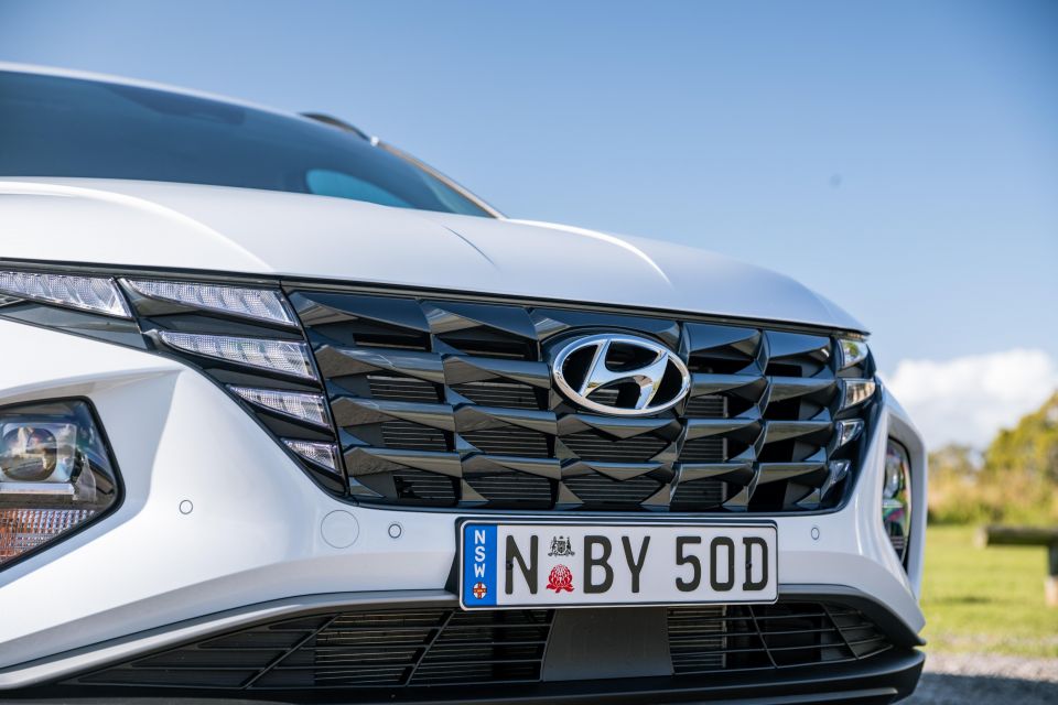
The current, iconic, Hyundai ‘H’ dates from 1990, and is an abstract representation of two people shaking hands with each other. This symbolises the mutual trust and satisfaction that Hyundai seeks to have between the company and its customers, and perhaps the importance that the company places on this relationship.
The letter H is surrounded by a circle emphasising the virtuous nature of this relationship and potentially alluding to the notion that Hyundai wants to engender trust will all of its customers around the world.
Kia is the sister company to Hyundai, and the complex nature of their relationship is explored further in the article linked. Interestingly, Kia is the oldest Korean car brand, tracing its origins back to the middle of the 20th century, and thereby has the most varied logo history here.
The first Kia emblem bears a striking similarity to Mitsubishi’s three diamond star except for the central component, which has the Kia wording encapsulated in what appears to be the outline of a gear. This is perhaps an allusion to the company’s roots as a manufacturer of bicycles and industrial equipment and the role that the company played in rebuilding a nation ravaged by years of war.
When the company entered the automotive industry through the licensed manufacture of various car models, its logo changed again, this time in a radically different direction that removed the Kia wording entirely, and replaced it with what appeared to be a green, upside down letter ‘Q.’ Apart from being much clearer, bold and less intricate than its predecessor, the rationale behind this particular design is unclear.
Nevertheless, the upside down Q lasted for more than 20 years until the mid-1980s, before the Kia lettering made a return, albeit in a different form. This time, the logo featured the Kia wording only in a highly stylised, almost avantgarde font, with the K in Kia being connected to the other letters through a wavy line. In some respects, this almost harkened back to the company’s industrial roots, with the letter ‘I’ in this logo particularly resembling the chimney of a factory.
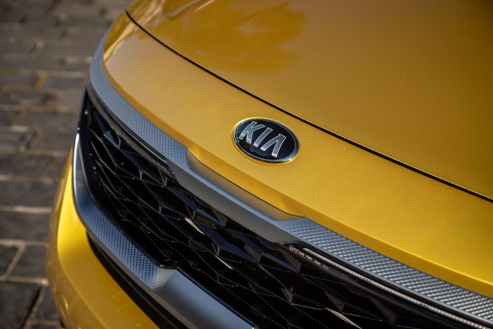
This was clarified again in 1994 with the logo that perhaps most people are familiar with, namely the Kia lettering clearly depicted in red, within a red ellipse. While the red colouring continued to be used in corporate and promotional materials, the cars’ badges eventually switched from a red background to a black one.
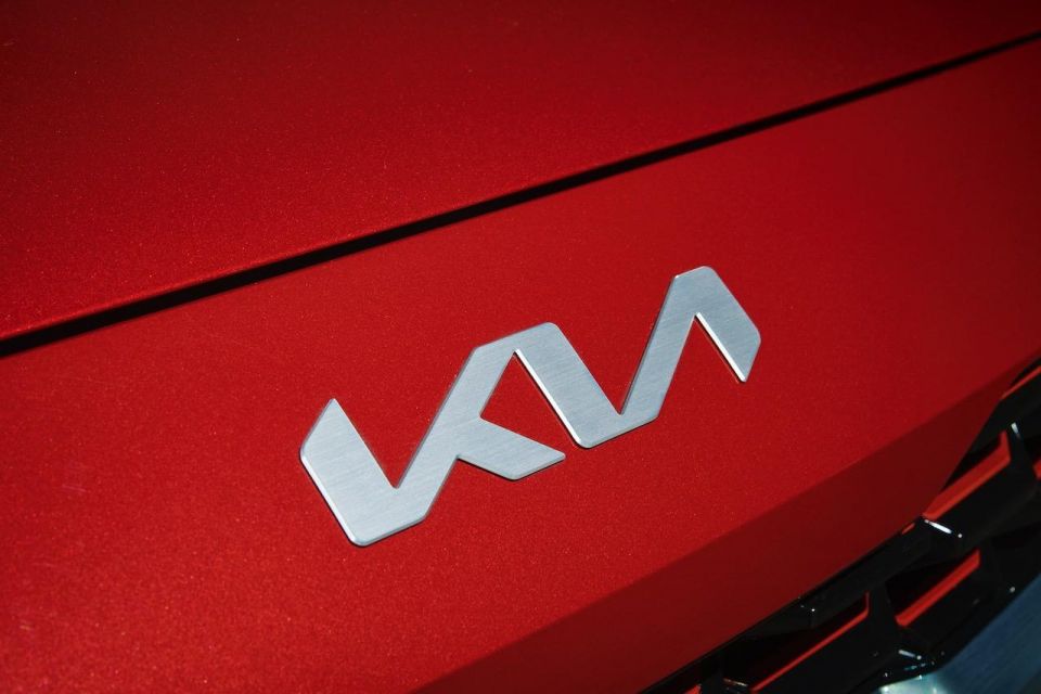
This year, Kia decided to transform its brand identity again with the unveiling of another new logo design fit for a more technology focused, electrified future. Comprising the word ‘Kia’ in an italicised, unbroken font, the marque says the new logo is almost a handwritten signature that underpins not only the company’s confidence and commitment to customers, but also contains elements of symmetry and rhythm that reflects the brand’s new slogan, “Movement that Inspires”.
In its local market of South Korea, however, Kia has long used a highly stylised, almost flowing, letter ‘K’ without a vertical backbone, set within an ellipse on a black background, rather than many of the emblem designs described above.
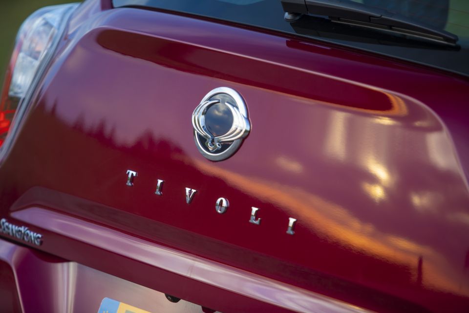
Despite being almost as old as its Kia and Hyundai compatriots, SsangYong is by far the most niche, and least successful, of the Korean carmakers featured here, having recently entered bankruptcy and looking to be sold by current parent company Mahindra. Historically, the company’s emblems have revolved around a stylised arrow, but it’s perhaps the firm’s latest two emblems that are the most interesting.
During the 1990s, the brand transformed its emblem with the introduction of a circular motif, consisting of two flattened, but overlapping ellipses largely contained within a wider circle. This was a unique design that could not only be recognised anywhere, but also bore some similarity to the figure eight sign used for infinity, thereby conveying a notion of timelessness and elegance.

The name SsangYong can be interpreted literally as ‘two dragons’, and the company’s latest, and current, emblem is another transformation that reflects this fact.
First appearing as a bonnet ornament on the flagship Chairman sedan, it consists of what appear to be two vertical wings that apparently form an open ring. These elements, however, are in fact a highly stylised and abstract representation of two rising dragons facing each other, symbolising, amongst other things, the concepts of freedom, growth and movement.
CarExpert
49 Minutes Ago


Dave Kavermann
2 Hours Ago


Damion Smy
2 Hours Ago
Damion Smy
3 Hours Ago

William Stopford
4 Hours Ago
William Stopford
5 Hours Ago
Add CarExpert as a Preferred Source on Google so your search results prioritise writing by actual experts, not AI.