
Derek Fung
Toyota Corolla Cross ute spied in Brazil
Toyota is prepping a small monocoque ute in South America to take on established models from Fiat and Chevrolet.
13 Hours Ago
American carmakers have been responsible for so many iconic model lines, including the Corvette and Mustang. But what about the history behind their badges?

Contributor

Contributor
From commercialising innovations such as the moving assembly line, to introducing iconic lines like the Mustang and Corvette, American carmakers hold a unique place in the automotive world.
The United States of America is known as the land of choice and opportunity, and accordingly, the badges of the nation’s carmakers aim to capture anything from the names of their iconoclastic founders, to the ultimate dreams of the company.
Henry Ford is widely regarded as a pioneer in the automotive industry, but perhaps less well known is that his eponymous Ford Motor Company was not the only automotive firm he founded. In fact, prior to commencing Ford Motor Company, Henry Ford had a predecessor firm, known as The Henry Ford Company.
Investors in this original company became disillusioned with the inordinate amount of time he was spending in motor racing activities (rather than automobiles for the general public), and following a dispute, Henry Ford left his own firm with $900 and his naming rights.
Initially unsure of what to do next, the company’s key investors decided to bring in another engineer, Henry M. Leland, to lead the development of the firm’s future cars. Together with the rest of company management, the firm was reorganised and renamed to The Cadillac Automobile Company in August 1902. The reborn company took its new name from Antione de la Mothe, sieur de Cadillac, a French explorer who founded the city of Detroit (where the new company was also based) in 1701.
A name was not the only thing that the company borrowed from its city’s founder, and the firm also used the Cadillac family’s intricate coat of arms as a basis for its own emblem. Forming a shield with a surrounding laurel wreath, the original emblem contained several distinct elements designed to emphasise the brand’s intent to be a precision manufacturer of prestige, luxury vehicles. These included a crown to represent the ancient courts of France and ducks (‘merlettes’) to symbolise the Holy Trinity.
The shield also incorporated two different colour schemes, namely a set of black and gold horizontal stripes, to represent wisdom and riches, and blue, white and red, to indicate ambition and valour. Although these seem to be human virtues, in the context of Cadillac as a company, they could perhaps be interpreted to symbolise the ambition and success that Leland hoped the company would have.
Later versions of the Cadillac logo kept the fundamental design of the crest, but altered the surrounding features, with the laurel wreath being replaced for a time by a V-shaped wing design, and the overall shape of the emblem being alternately elongated and compressed.
The merlettes disappeared from the logo after a poorly-received advertising campaign for the 1996 Cadillac Catera, which featured one of the merlettes coming to life.
More recently, the Cadillac emblem has focused on a wider, modernised version of the coat of arms itself, with the crown and later the wreath being removed.
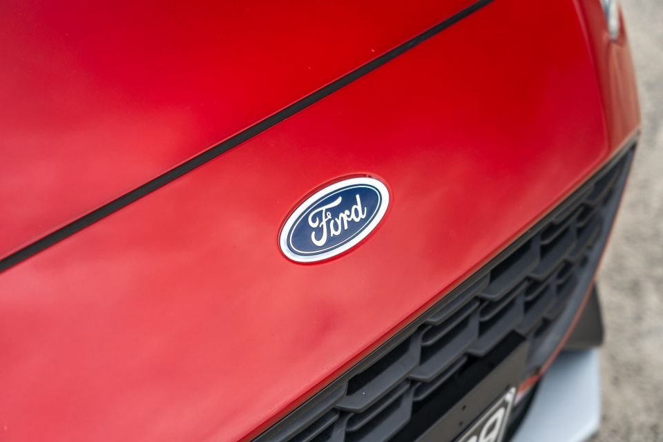
Having left what would go on to become Cadillac, Henry Ford founded another eponymous company, the Ford Motor Company. This time, his involvement was far more successful, and Ford has gone on to become a major multinational corporation and one of the largest automotive companies in the world.
Ford’s most significant innovation early in its history was commercialising the concept of the moving assembly line, which enabled the mass-production of the affordable Ford Model T, and the firm’s logo has largely reflected this focus on utilitarian simplicity.
Initially including the words ‘Detroit, Mich.’ to denote the city and state where the company was headquartered, the first Ford logo used a relatively simple font on a black background, with an elaborate and then-fashionable art-nouveau border. However, this was quickly phased out, with Henry Ford’s friend, Childe Harold Wills, being brought in to design a new logo in 1907. Legend has it that Wills used his grandfather’s stencil set to create the iconic Ford font. This was later modified into a more ‘winged’ version in 1912 with an elongated letter ‘F’ that continues to be used today.
Wills’ initial design only featured the Ford lettering without any background, and experimentation continued with finding a suitable background, with designs including a winged pyramid (intended to demonstrate the stability and speed of Ford cars) and a simple monochromatic oval.
Meanwhile, Ford’s UK business had been unofficially using a blue oval as a background, with the royal blue colour symbolising the reliability, economy and affordability of Ford cars. The company decided to officially adopt this design in 1927, and little has changed since, apart from the introduction of a gradient to the blue colour in 1976.
For some time, Ford didn’t use the Blue Oval on its cars and instead used it for press and other corporate materials. Instead of a logo, Ford cars typically featured plain lettering.
Interestingly, Henry Ford II did attempt to change and modernise this logo during the 1960s by hiring designer Paul Rand, but disliked the proposed idea, and instead retained the existing design.
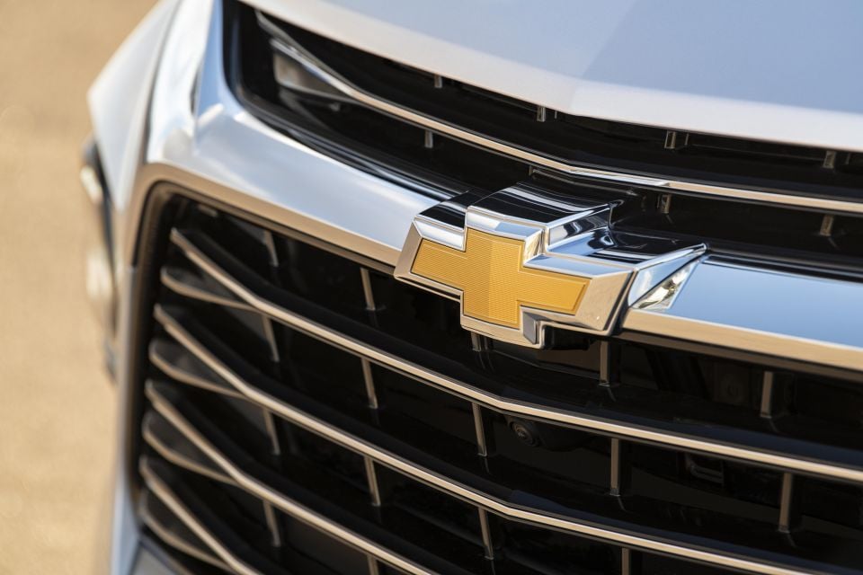
Alongside its Cadillac stablemate, Chevrolet is another brand in the General Motors empire, and often referred to as the bowtie brand.
Founded in 1911 by Swiss engineer Louis Chevrolet and, at the time, former GM executive William C. Durant, the initial Chevrolet emblem was, like Ford’s at the time, simply a stylised take on the Chevrolet name. It featured an oversized ‘C’ almost encapsulating the remainder of the letters.
The bowtie was introduced two years later in 1913 as Durant’s idea. It remains unclear how he was inspired to create the bowtie, but potential theories include an ad for ‘Coalettes’, charcoal bricks used to light fires which featured an almost identically-shaped logo, as well as a hotel wallpaper decoration that Durant saw when visiting Paris.
Regardless of where it came from, the bowtie proved to be a memorable emblem design that successfully differentiated Chevrolet’s vehicles from its competitors, and the overall bowtie shape has endured since.
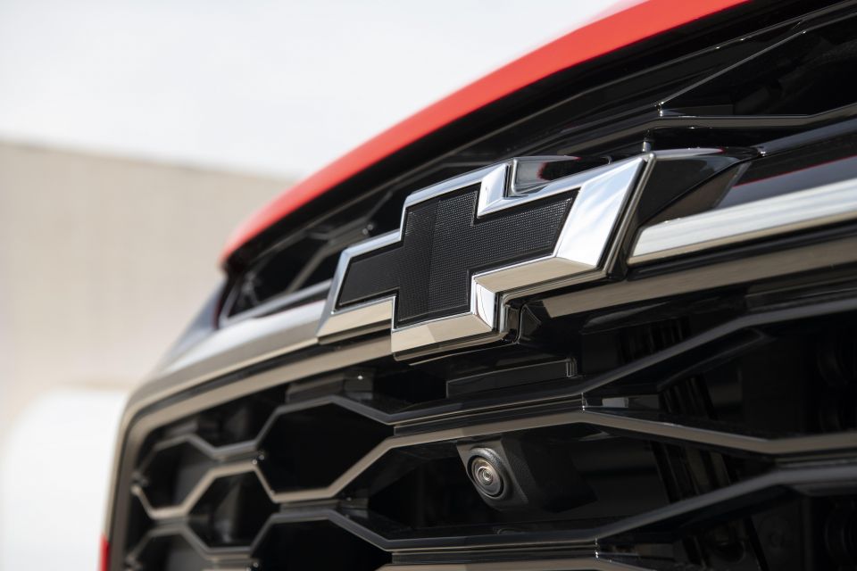
In its most recent iterations, the bowtie no longer encapsulates the Chevrolet wordmark, and is instead filled with a gold background intended to allude to the strength and power of the brand, and further enhance its recognisability. Previous iterations have included the bowtie simply being an outline, or filled in with a blue colour.
More recently, black bowtie badges have become optional on several Chevrolet models, while the 2022 Bolt and Bolt EUV will feature black badges as standard.
Out of all the brands described in this story, it’s perhaps Chrysler that has had the most varied of logos. Currently part of Stellantis, the firm was founded in 1925 by Walter P. Chrysler, who wanted his cars to compete directly with more luxury-oriented brands including Ford’s Lincoln division and Cadillac.
The best way to do this, of course, was to ensure a consistently high level of quality. Correspondingly, the first versions of the Chrysler emblem were literal interpretations of a wax ‘seal of approval’ emblazoned with the Chrysler wordmark.
Early on, this seal also featured ribbons pointing downwards from the bottom right, which, much like sports ribbons earned during an athletics carnival, also purported to be another mark of performance.
Wings are another important part of the Chrysler emblem, and these have accompanied the seal of approval and wordmark on-and-off in various iterations, with recent versions featuring a very wide (but slim) variation.
Perhaps the most notable secondary Chrysler emblem is the Pentastar logo, first introduced in 1962. The firm wanted a separate identity to distinguish itself from the wings and seal of approval that it applied to its cars, and so the Pentastar was chosen from 800 proposed designs for its clear, geometrical design which retained an engineered appearance of precision and high-quality.
On its vehicles, the Pentastar would often be placed behind the car’s front wings or used as a hood ornament. It was also used as a corporate logo for the Chrysler Corporation, retired during the “merger of equals” with Daimler, returned in 2007, and then retired again with the formation of Fiat Chrysler Automobiles.
It lives on in the form of a two storey-high window, constructed in 1996, atop Chrysler’s Auburn Hills, Michigan headquarters.
Derek Fung
13 Hours Ago


Ben Zachariah
15 Hours Ago

Josh Nevett
15 Hours Ago

CarExpert
15 Hours Ago

CarExpert
16 Hours Ago


Matt Campbell
23 Hours Ago
Add CarExpert as a Preferred Source on Google so your search results prioritise writing by actual experts, not AI.