

Damion Smy
New Audi A6 allroad revealed, Australia under evaluation
Audi Australia is eyeing the new-generation A6 allroad for local showrooms, after it was unveiled in Europe with more distinctive off-road upgrades.
45 Minutes Ago
Italian marques have been responsible for some of the most iconic cars ever designed, and their badges have an equally prominent history.

Contributor
Contributor
Whether it’s for their stunning design, their perceived unreliability, or a highly emotional driving experience, one thing that most drivers of Italian cars can agree on is that they provide an unforgettable ownership experience.
Italy as a nation had a highly eventful history during the 20th century, and the product of this was the rise of some remarkable carmakers. The logos of the marques described in this story, namely Alfa Romeo, Fiat, Abarth and Lamborghini, reflects the history, and in some cases the ambitions, of the company that its badge represents.
Alfa Romeo is one of the few car brands that uses an emblem featuring a mythical creature, and a carnivorous, human-eating snake at that. The origins for this, and the flag to the left of it, lie in the founding of the company.
To find out more, we must go back more than 110 years to the founding of the company in 1910. The ‘Alfa’ in ‘Alfa Romeo’ is actually an acronym for the Italian phrase ‘Anonima Lombarda Fabbrica Automobili’, which translates to English as “Lombard Automobile Factory, Public Company.’ A group of investors, led by Ugo Stella, had bought this factory from failing French marque Darracq to create Alfa as an independent entity around it.
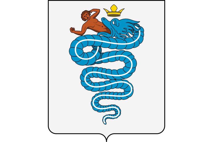
Legend has it that the fledgling firm’s designer, Romano Cattaneo, was looking for some inspiration for an emblem when he noticed a series of flags and crests decorating the Castello Sforzesco in Milan. One of these was the coat of arms of the noble Visconti family, featuring a ‘biscione’ (grass snake) consuming a human, and the other was the coat of arms of the city of Milan, represented by a red cross upon a white shield.
Cattaneo took these two core symbols of Milan and positioned them in tandem to form the basis of the Alfa Romeo emblem, with these elements remaining a fundamental part of the logo to this day.
The brand’s first emblem complemented these elements with a blue border that featured ‘Savoy knots’, figure-eight knots that represented the Savoy family which helped to unify Italy into a single country in 1861, as well as name of the city where the factory was located, Milano (Milan).
With the First World War raging shortly after the company’s founding, entrepreneur and engineer Nicola Romeo was brought in in 1915 to help convert production to military equipment such as aeroplane engines and ammunition. By the end of the war, he had obtained ownership of the entire firm. To reflect this change in ownership, the company was renamed to the now famous ‘Alfa-Romeo’ brand.
With only minor changes to the font of the words ‘Alfa-Romeo’ and the removal of the Savoy knots and Milano wording, the Alfa Romeo emblem has remained fundamentally the same since the company was renamed to Alfa Romeo. Perhaps the most notable change occurred just after WWII, when the emblem used a simple two-tone red and gold design as the machines that previously produced multi-coloured logos had been destroyed during the war.
In recent decades, the emblem has been gradually simplified with the latest iteration, unveiled in 2015, modernising the design through a uniform silver background colour and removing the strict vertical division between the biscione and the cross.
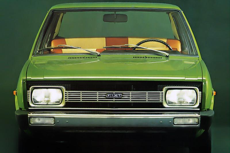
Fiat is Italy’s oldest operational automotive manufacturer, with a history going all the way back to the end of the 19th Century. Much like the ‘Alfa’ in Alfa Romeo, Fiat is also an acronym, standing for ‘Fabbrica Italiana Automobili Torino’ (Italian Automobile Company Turin).
Established in 1899 by Giovanni Agnelli and a group of investors, the company has had a multitude of different logo designs. As an aside, the Agnelli family today retains significant stakes in various enterprises, including Fiat’s new parent company, Stellantis, and the famous football club Juventus FC.
Fiat’s first logo was a simple spelling out of the company’s full name on an otherwise unadorned brass plaque with the Fiat acronym underneath. With the business on a more stable footing by the turn of the century, an actual emblem was developed, and the full name of the company was replaced with ‘FIAT’ lettering in an elaborate art nouveau style befitting of the fashion at the time, with the colour palette consisting of an eye-catching blue and gold, and subsequently blue and white, background.
The history of Fiat logos thereafter is perhaps best divided by eras based on the shape of the emblem. 1921 saw the advent of the circular age of Fiat logos, with the elaborate ovoid and rectangular shapes giving way to a far simpler, starker design with the FIAT lettering imposed on a relatively plain background. This continued, with the colour combination alternating from red and white, to blue and gold, and then blue and silver.
The 1930s brought a change in shape from circle to narrow rectangle, with a perhaps more art deco font used to heavily elongate the Fiat lettering to almost mimic the vertical fins of a radiator grille. This style continued in various iterations, with the Fiat lettering on a red background, until 1968.
The following redesign was arguably the most dramatic in Fiat’s history. Gone was the conventional rectangular shape and elongated, art deco lettering, and in its place was a highly modern, geometric design with the four Fiat letters each positioned in a self-contained rhombus that made up a highly stylised parallelogram.
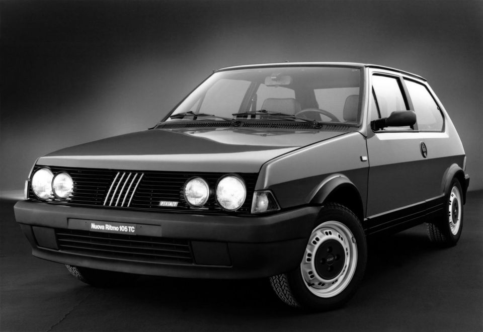
This design allowed the focus to be on the Fiat lettering itself, although this design was evolved in 1982 when the letters themselves were removed, leaving just the essence of the new logo design, namely five slanted lines.
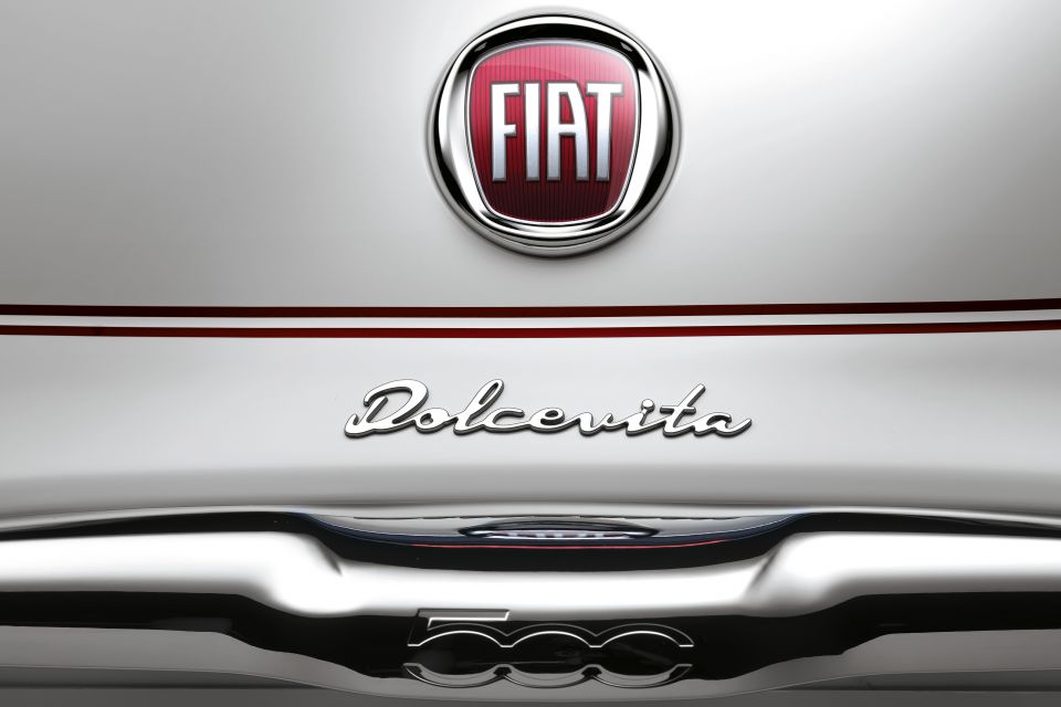
More recently, Fiat branding has returned to a modernised circular design harking back to the original circular emblems of the 1920s.
An update in 2020 removed the circle altogether, returning focus back onto the bold Fiat lettering.
Abarth is famously known as the scorpion brand and today serves as Fiat’s performance arm, in a somewhat similar capacity to Mercedes-AMG or BMW M. Originally, however, the firm was founded as an independent business by Carlo Abarth in 1949 selling aftermarket parts for various Fiat vehicles before modifying otherwise basic cars such as the Fiat 600 into motorsport weapons.
Carlo Abarth’s astrological sign was Scorpio, and moreover, he wanted his firm to utilise a badge that would be difficult to copy. These desires converged in the use of the scorpion as the hallmark feature of the Abarth emblem. Of course, it also helped that the scorpion is commonly perceived as a small but tough, aggressive and ferocious creature.
Initially consisting of a blue scorpion, the Abarth logo took its present shape when the scorpion was changed to an all-black design, superimposed upon a yellow and red shield, with these colours not only providing a strong contrast, but also harking back to the colours of the city of Merano, Carlo Abarth’s ancestral homeland.
Apart from subtle updates incorporating the Italian tricolour and font alterations, the Abarth logo has changed little since the adoption of the shield in 1954.
Much like how Abarth is the scorpion brand, Lamborghini is known for being the brand of the fighting bull, with many of its models being named after famous bulls, and the firm’s emblem prominently centred on a bull about to charge.
Founder Ferruccio Lamborghini was already prominently known in Italy for his manufacture of tractors following the end of WWII, and his wealth from the tractor business and other ventures allowed him to amass a collection of cars, including various Ferraris. Nevertheless, Lamborghini was dissatisfied with Ferrari’s vehicles, which he felt required constant maintenance and were too uncomfortable, and so decided to try and beat Ferrari at their own game with the founding of Automobili Lamborghini in 1963, his own car manufacturing operation.
One of Lamborghini’s pastimes was watching Spanish fighting bull competitions, and moreover, his astrological sign was Taurus, so having the bull as the emblem for the new company made perfect sense and also represented his competitive spirit. The background colour of the shield was initially red until 1972, before moving to a monochrome design with an italicised, sans-serif font.
The current Lamborghini emblem, with a golden bull upon a black background, has been in place since 1998. In all cases, the bull is depicted in a similar pose, rearing up and about to charge.
Damion Smy
45 Minutes Ago

Damion Smy
3 Hours Ago

CarExpert
7 Hours Ago

Dave Kavermann
8 Hours Ago

Damion Smy
9 Hours Ago

Damion Smy
10 Hours Ago
Add CarExpert as a Preferred Source on Google so your search results prioritise writing by actual experts, not AI.