
William Stopford
2026 Chevrolet Corvette E-Ray review
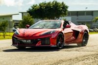
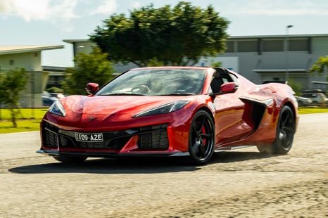
The Chevrolet Corvette has gotten even better for 2026, with an overhauled interior that makes this supercar even more liveable.
5 Hours Ago
French marques are known for avant-garde design, and this is represented in their badges as well.

Contributor
Contributor
From cars with hydropneumatic suspension to models with concave rear windscreens, and countless other vehicles with curious ergonomics, the French are known for producing uniquely-designed and engineered cars.
The three most famous French brands – namely Peugeot, Citroën and Renault – all have rich histories (Peugeot in particular is centuries old), and during that time have had their fair share of great (and not so great) models.
More recently, Renault has revived its Alpine sports car brand and Citroën, under PSA (now Stellantis) leadership has created an exclusive DS brand focusing on luxury cars.
Whilst none of the French brands are major sellers locally, they maintain a substantial presence in Europe, and to a lesser extent, South America and China.
Peugeot is arguably the oldest family business still partaking in the automotive industry; the firm being able to trace its roots back more than 200 years as a steel foundry owned by brothers Jean-Pierre II and Jean-Frédéric Peugeot.
Their foundry business expanded to the manufacture of a variety of steel-based products, including coffee grinders, springs, and saws. When the time came towards the middle of the 19 century for the firm to have a logo, the Peugeot family sought a symbol that would perfectly represent the characteristics of their product.
The lion, standing on an arrow, was the perfect match. Its teeth alluded to the sharpness of the blades and the rest of the animal represented the strength and durability the Peugeot family hoped the company, and the rest of its products, would imbued represent.
This fundamental design was retained when the company developed its first steam-powered car in 1889.
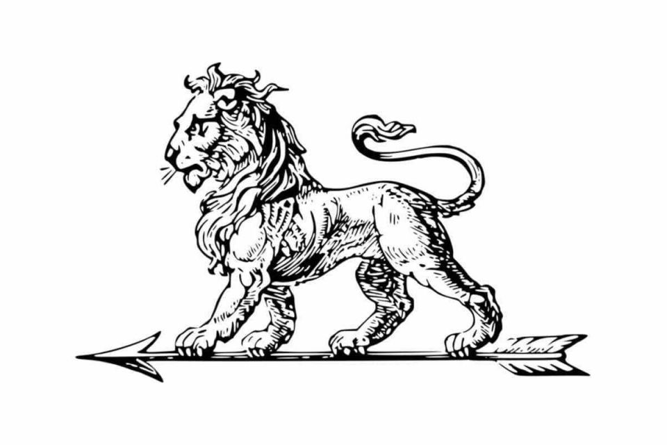
In the early 20 century, vehicles tended to have long bonnets and enormous radiator grilles to provide adequate cooling for the engine, and most marques topped this off with a bonnet ornament to signify who had made the car. Peugeot was no different, and cars made by the firm during this time used a roaring lion’s head (the company emblem also changed to a roaring lion about to leap).
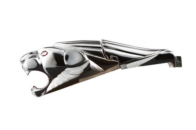
More recently, Peugeot’s logo design has alternated between a heraldic lion rampant based on the flag and coat of arms of the Franche-Comté region in France, and a two-dimensional depiction of a roaring lion’s head.
The former was used periodically from 1948-1960, and again from 1976-2020 with some modifications.
Peugeot’s new logo, first previewed with the e-Legend concept in 2018 and revealed in finalised form earlier this year with the new 308, consists of a lion’s head instead, and is directly inspired by the emblems used between 1955 and 1976.
Citroën was founded by entrepreneur and industrialist Andre Citroën, and the automotive company’s logo has always revolved around the use of a double chevron.
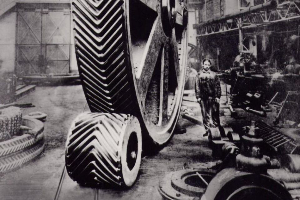
The double chevron dates from Andre’s previous experiences as an engineer and businessman. In 1900, he bought a patent from a Polish factory for the design and use of a herringbone (‘V’ shaped) gear used in milling, which used chevrons to perform more smoothly and quietly than conventional designs.
The family business, Engrenages Citroën, was able to successfully manufacture these gears, so when Andre decided to establish his own company in 1919 for the development and production of automobiles he designed an emblem that would feature the double chevrons as a mark of good luck.
Initial designs of the Citroën logo placed the double chevrons within a circle, with yellow and blue the primary colours. From 1932-1935, the chevrons were accompanied by a water and swan graphic, to allude to the smoothness and tranquillity of the ‘floating engine’ used in the Citroën Rosalie.
Unfortunately, the floating engine had little to do with water, and instead referred to the fact that the was suspended on mounts which acted to reduce noise and vibrations into the cabin.
With the demise of the Rosalie lineup, the logo reverted to its simple, but clear, ‘chevrons within a circle’ graphic until the middle of the 20 Century.
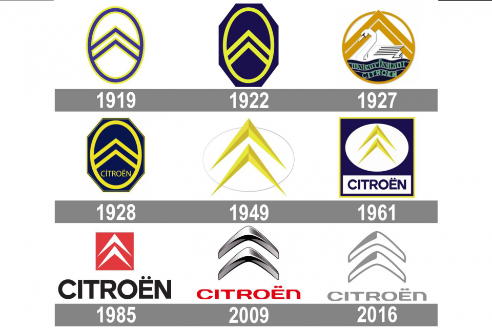
More recently, the Citroën emblem has focused on the design of the chevrons themselves, with a stylised, more rounded version launching in 2009 that does away with background graphics. As arguably the most innovative of the French manufacturers, it is perhaps fitting that Citroën’s logo has always harked back to the mechanical, engineering-led origins of the helical gear.
DS Automobiles is an independent luxury brand currently under Stellantis ownership, but was initially formed as a premium sub-brand of Citroën in 2009, with early models such as the DS3, DS4 and DS5 attempting to take the brand upmarket.
The DS name is a reference to the landmark Citroën DS, a technological masterpiece on wheels, and perhaps symbolises the hope that one day vehicles sold under the DS nameplate will replicate the innovative character of the brand’s spiritual predecessor.
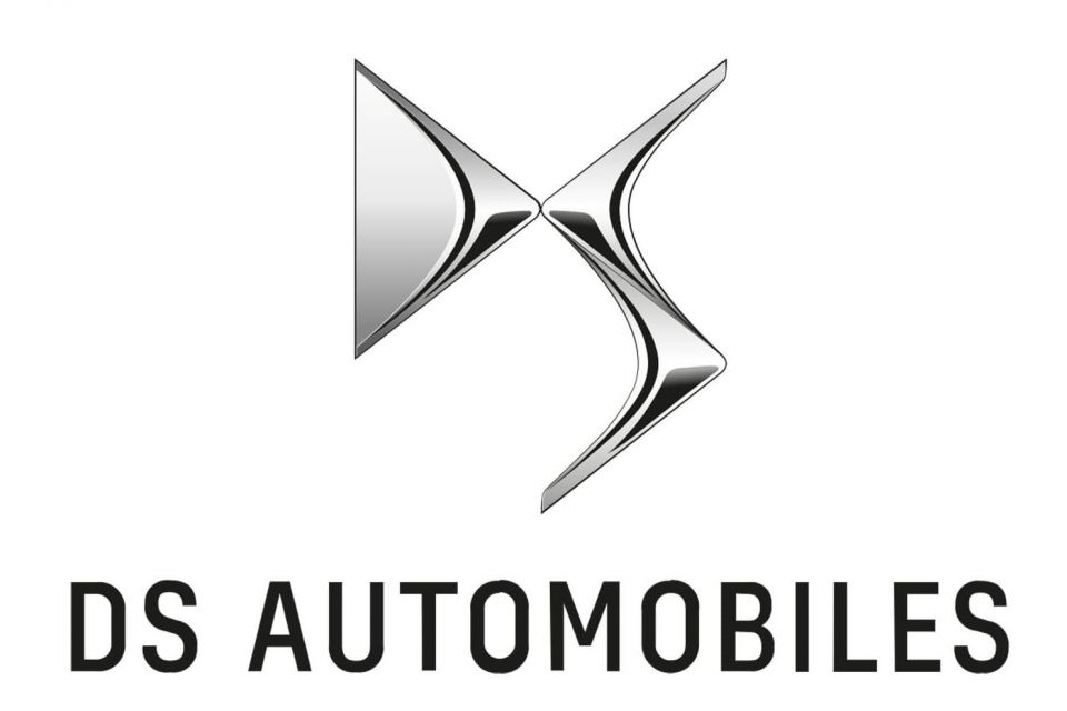
Despite a history closely associated with Citroën, the DS marque only launched 11 years ago, and as such its logo has seen little changes since.
It consists of heavily stylised ‘D’ and ‘S’ letters with three-dimensional, almost diamond-like accentuations that make the letters appear almost formed out of metal. The emblem is perhaps also a reference to the intricate, diamond like design motifs found on various DS models today.
Unfortunately, the DS brand is not currently available in Australia.
Renault was established by the Louis, Marcel and Fernand Renault as an automotive firm.
The newly-formed company’s first logo was a representation of this fact, consisting of two intersecting ‘Rs’, and the cars were branded only with the Renault name.
The entity finally had a proper logo in 1906, with Renault attempting to make the most out of the fact they won the original Grand Prix by using an image of the race-winning car as their emblem.
Following the end of the First World War, and with the original Grand Prix victory now a distant memory, a new emblem was needed.
The firm decided to stick with a simple, almost utilitarian design incorporating the Renault name within an ovoid grille. At the time, however, Renault cars were known for their trademark dihedral ‘alligator’ bonnet design, which consisted of two pieces of metal conjoined at an angle, with a seam running in between.
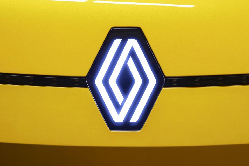
The company quickly realised that rather than an ellipse an angular shape would suit the bonnet design much better, and thus the iconic Renault diamond was born in 1925.
This diamond, with Renault emblazoned through the middle, would continue, with modifications, for several decades until 1972, when it was decided that the Renault brand was strong enough to stand without spelling out the name of the company.
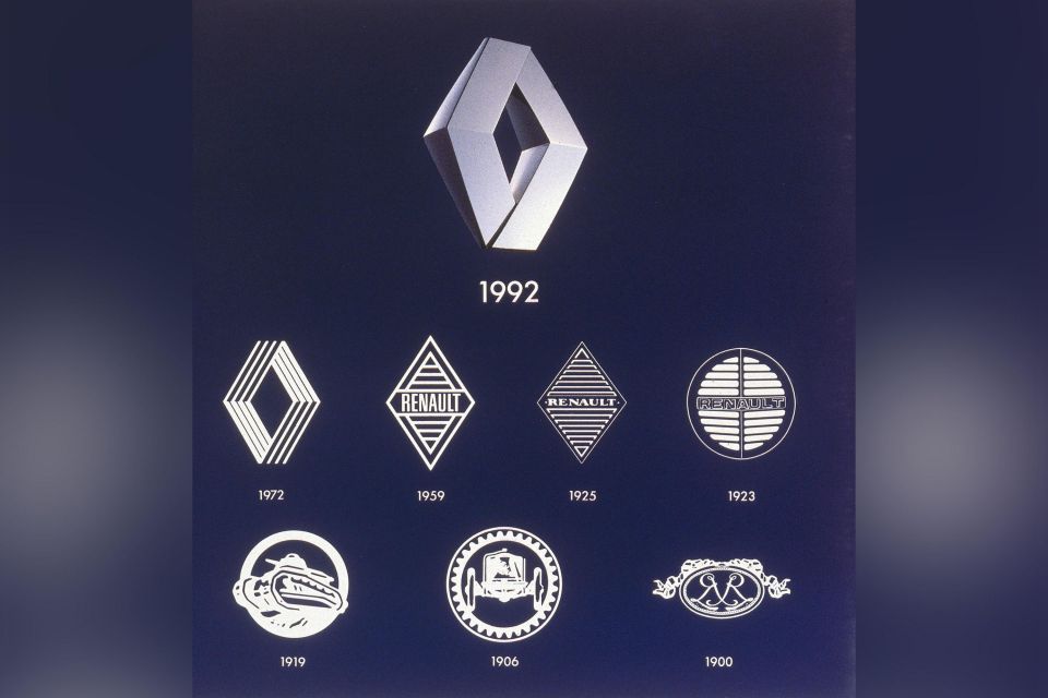
In turn, artist Victor Vasarely was commissioned to create a new form for the diamond, and the end product was a more modern and precise design, featuring three sets of parallel lines.
This was later simplified in 1992 with a solid diamond, which formed the basis for the contemporary Renault logo.
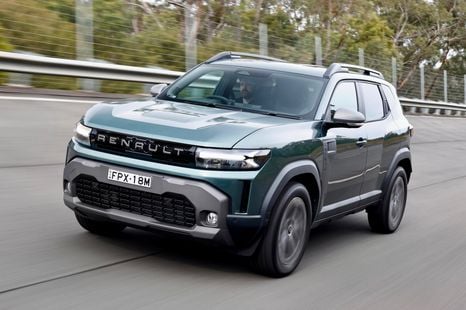
Today’s Renault is rapidly expanding into the world of electric vehicles, with the brand having announced that it will launch an all-new EV within three years inspired by the classic Renault 5.
In line with this the brand has recently unveiled a new emblem, which retains the iconic diamond but reinterprets it as a set of interlocking lines, bearing a strong resemblance to the 1972 diamond.
Much like the relationship between DS and Citroën, Alpine’s history is intimately connected to Renault, and currently the marque is in the process of superseding Renault Sport as the firm’s performance brand.
It is currently unclear whether, in addition to being a standalone brand, Alpine branding will also be used to denote performance Renault-badged models.
The firm itself started under the auspices of Renault dealer Jean Rédélé, who modified various Renault models to prepare them for racing. The first distinct Alpine car, the A106, launched in 1955 based on Renault 4CV underpinnings.
Later models such as the 1961 A110 (predecessor to the today’s A110) also shared parts with Renault models such as the R8 sedan. This close relationship led to Renault taking over the firm in 1973.
During this time, the Alpine emblem has consisted of a stylised, italicised ‘A’, with the horizontal line to form this letter almost resembling an arrow.
In combination with the slanted letter design, this creates the impression of a brand constantly in motion, perhaps an allusion to the company’s focus on lightweight performance cars.
William Stopford
5 Hours Ago

CarExpert
21 Hours Ago
CarExpert
21 Hours Ago


Paul Maric
21 Hours Ago

Derek Fung
1 Day Ago

Max Davies
1 Day Ago
Add CarExpert as a Preferred Source on Google so your search results prioritise writing by actual experts, not AI.