

James Wong
2026 Xpeng G6: Preliminary details confirmed for relaunched Model Y rival
Initial specifications for the updated Xpeng G6 have been confirmed for Australia ahead of a July 1 relaunch for the Chinese EV brand.
3 Hours Ago
German automotive brands are rich in history, and that also applies to the stories behind their logos.

Contributor

Contributor
German automotive brands are some of the oldest in the world. Opel, Mercedes-Benz and Audi are all able to trace their origins to the 19th century, while BMW was initially founded to supply aircraft engines to the German war effort in World War I.
Meanwhile, Porsche was commissioned to design the first Volkswagen by the Nazi German government in the early 1930s.
All of this means that, unlike their Japanese counterparts, whose logos tend to reflect the values and ambitions that the company aspires to, German brands typically draw from the colours or the crest of the location that they were founded in or from their corporate history.

It’s a common misconception that BMW’s famous blue and white roundel harkens back to its heritage as an engine manufacturer for aeroplanes, with the white quadrants representing a propeller spinning against the backdrop of a blue sky.
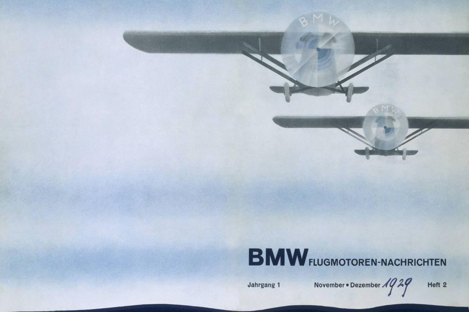
BMW itself is partly to blame for pedalling this myth, with advertisements during the Great Depression explicitly linking the emblem’s design to aviation in a marketing effort to promote its heritage as an aircraft manufacturer.
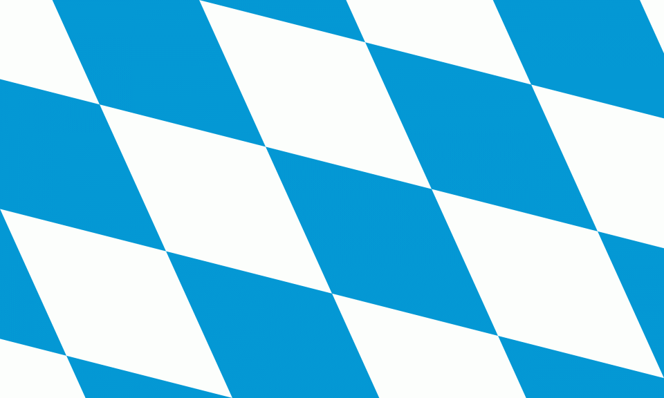
In reality, however, the emblem derives its colours from the blue and white of the Bavarian flag, with the four quadrants an adaptation of the traditional lozenge flag design.
The surrounding black ring has its own, separate origin, and is a symbolic reference to BMW’s predecessor company, Rapp Motorenwerke, which was also an aircraft engine manufacturer based in Munich.
Apart from relatively minor font changes for the ‘BMW’ lettering within the black ring, the BMW badge itself has remained largely unchanged. Perhaps the most recent notable alteration was the firm opting to replace the black ring with a transparent border for digital materials (and concept cars) only.
The Mercedes-Benz story is a story of arch-rivals. While Karl Benz, and his firm, Benz & Cie, is widely credited with inventing the first car powered with a petrol internal combustion engine, Daimler Motoren Gesellchaft (‘Daimler Motor Company’) followed soon afterwards.
The two firms were locked in direct competition for more than 20 years before deciding to merge into the entity known as Daimler-Benz, which would then continue to produce vehicles under the Mercedes-Benz brand name.
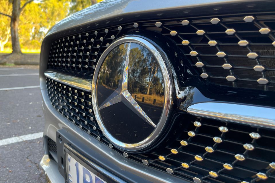
Prior to the merger, Benz & Cie had trademarked a logo containing the ‘Benz’ lettering within a laurel wreath. Meanwhile, Daimler had come up with a distinct three-pointed star logo, not only to represent the fact that its engines were being used in the air, on land and in the sea, but also as a nod to company founder Gottlieb Daimler’s habit of using a three-pointed star to mark the location of the family home on postcards.
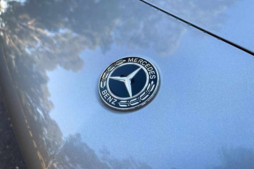

Upon the formation of Daimler-Benz, the two logos were combined, with the three-pointed star sitting inside the laurel wreath. Over time and depending on application, the laurel wreath has been simplified to the familiar silver ring.
On Mercedes-Benz vehicles, the traditional laurel wreath emblem is found on the bonnet, while the grille (or bonnet ornament) will feature the simplified three-pointed star within a silver ring.
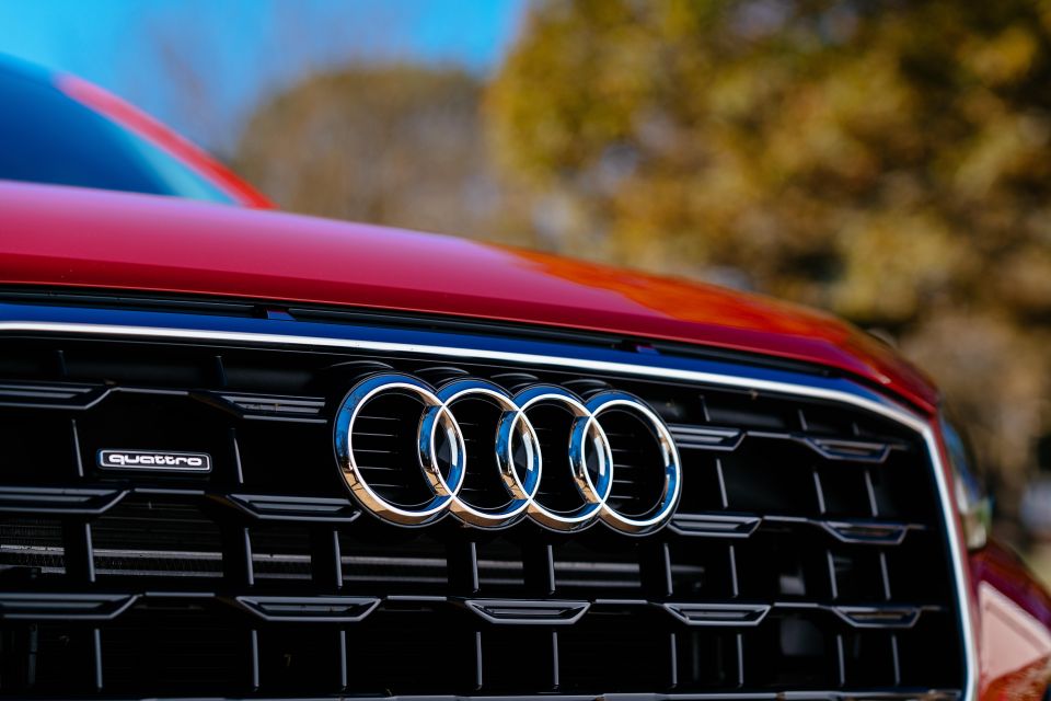
The Audi emblem is famously simple, consisting only of four interlocking circles. Each circle, in turn, represents one of the companies that merged in 1932 to form the modern Audi AG. These firms were all geographically close to each other, being based in the German state of Saxony.
Key to the creation of the modern Audi brand was August Horch, a mechanical engineer who established his first company, August Horch & Cie, in 1899. Horch had previously worked at Benz & Cie, and this experience held him in good stead to develop his own line of vehicles powered by two and four-cylinder engines.
His company was soon incorporated, however differences with the firm’s board of directors led him to resign from his original firm and instead start another, separate automotive company.
Horch couldn’t use the same name for his new enterprise, so instead simply translated his surname into Latin, where it equated to ‘Audi’ (which in English, translates to ‘listen’). At this time, the firm officially traded as Audi Automobilwerke GmbH, established in 1910.
Whilst Horch and Audi were focused on building cars, DKW (short for Dampkraftwagen, which translates as “steam-driven vehicle”) was focused initially on steam-engined cars, before moving on to two-stroke motorcycle engines in 1919.
The final piece of the puzzle was Wanderer. The oldest of the four companies described here, the entity was incorporated as Wanderer Fahrradwerke AG in 1896. Initially building bicycles, the firm expanded to motorbike production in 1902 and automobile production in 1913.
The Great Depression of the 1930s compounded the dire financial situation of a country already required to pay heavy war reparations, and this meant that the four firms could not survive independently. Instead, they merged to form Auto Union AG.
Over the following decades, this entity would be acquired first by Daimler-Benz, and subsequently by Volkswagen, which would consolidate and retain the Audi brand name only.
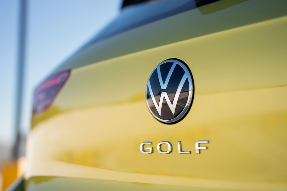
Volkswagen translates literally to ‘folk’s car’, or ‘people’s car’, and the firm was established by the Nazi German government with this objective in mind: to create an affordable car for the people that would be able to travel along the nation’s newly constructed autobahns.
Adolf Hitler hired Ferdinand Porsche to design the first Volkswagen, commonly known as the Beetle. The brand logo, a simple V imposed on top of the W, reflects these utilitarian origins.
The swastika was the pervading symbol of Nazi Germany, and the original logo had ‘fins’ extending outward from the VW lettering to recreate a stylised version of this symbol.
Following WWII, Nazi references were removed to focus on the superimposed arrangement of the ‘V’ and ‘W’ letters, with the width and proportion of these letters changing over time to a chiselled, 3D effect look, before returning to a thinner, flat 2D interpretation in 2019.

Out of all the companies described in this article, it is perhaps surprising that Opel has the oldest and most varied history. Initially founded by namesake Adam Opel in 1862 as a manufacturer of sewing machines, the company’s first emblem was a highly elaborate interpretation of his initials.
As the company expanded from sewing machines to gradually produce bicycles, cars and trucks, the logo evolved correspondingly.
Early emblems of the firm had been very intricate in design, with some featuring detailed images of the Roman goddess of victory (Victoria), and others in the early 1920s using an art-deco design with the ‘Opel’ letters written in a sharp, stylised font within an ellipse, to form the Opel eye.
The contemporary ‘lightning bolt’ emblem design traces its origins back to the early 1930s. At this time, Opel sought to introduce a range of light delivery trucks to rapidly transport cargo around Germany, and to find a suitable name, launched a nation-wide competition.
The winning entry was the name ‘Blitz’, (which translates to ‘lightning’ in English) and a new logo was designed for the Opel Blitz range specifically that featured the first iteration of the characteristic lightning bolt.
Meanwhile, Opel’s passenger car models progressed to use a Zeppelin-style airship within a circle as the logo. The circle alluded to the wheel, and given the novel nature of airships at the time, the use of a blimp represented technological progress and innovation. Combined, these two elements sought to portray Opel as a manufacturer of technically advanced cars.
Later on, the use of the protruding blimp became increasingly abstract, to the extent it was restyled to represent the original lightning bolt used on the Blitz truck. Over the last several decades, the lightning bolt has progressively morphed to arrive at the distinct, horizontally symmetrical logo used on Opel products today.
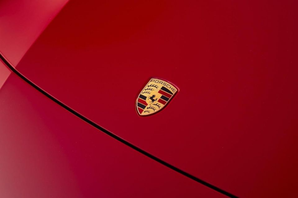
Ferdinand Porsche’s early career included a stint with Daimler, but in 1931 he decided to establish his own firm as an automotive consulting company. Porsche wouldn’t build cars, but would instead provide engineering and design services. Of course, one of the new firm’s major assignments would be to design the original Volkswagen under the direction of the Nazi German government.
The famed Porsche crest has not undergone any significant changes during its history, and continues to be an intricate representation of the city and state that the company continues to call home, namely Stuttgart and Baden-Württemberg respectively.
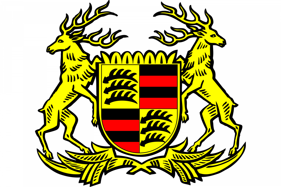
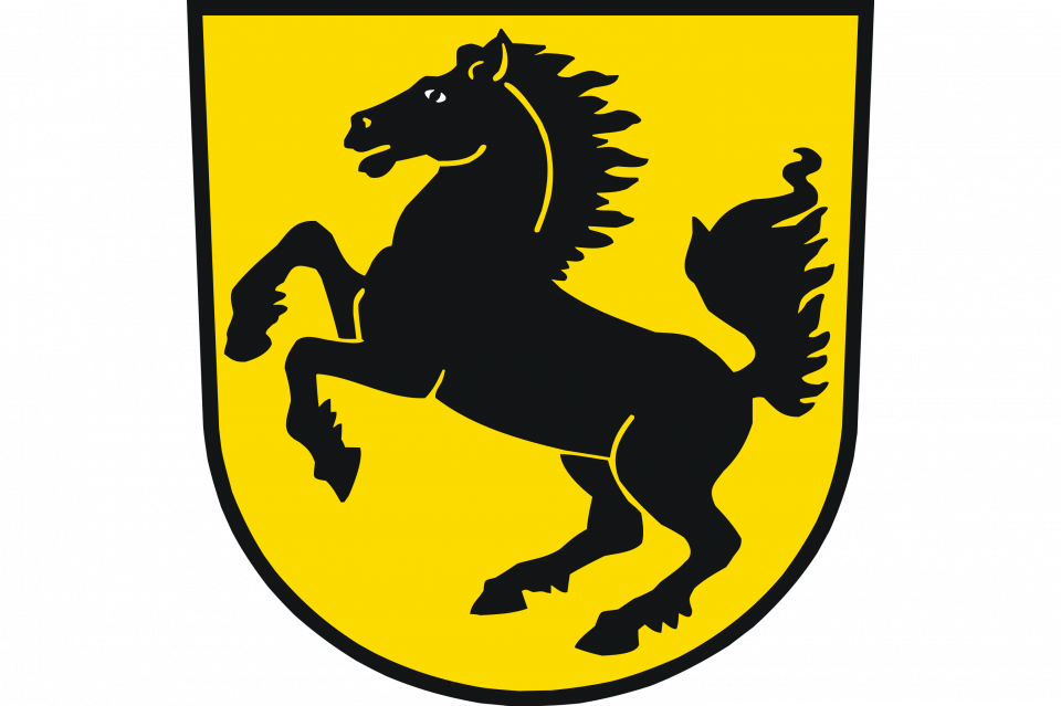
The name Stuttgart derives from the Old High German word ‘Stuotgarten’, which translates to stud farm, and references the city’s original history as a centre for breeding horses.
Correspondingly, the Stuttgart coat of arms prominently features a horse, and the Porsche emblem borrows this for the central element of its logo. Similarly, Württemberg’s historic coat of arms made use of antlers, as well as black and red stripes, and this design forms the basis for the remainder of the Porsche crest.
James Wong
3 Hours Ago


Josh Nevett
3 Hours Ago


William Stopford
19 Hours Ago


Damion Smy
19 Hours Ago


CarExpert
19 Hours Ago

CarExpert
20 Hours Ago
Add CarExpert as a Preferred Source on Google so your search results prioritise writing by actual experts, not AI.