
CarExpert
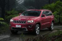
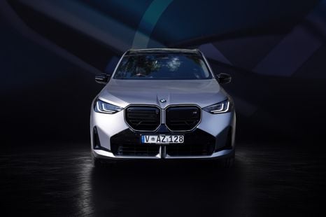
2026 CarExpert Choice winner: Best Luxury Mid-Size SUV
Distinctive styling inside and out, standout technology and classic BMW dynamic excellence make the X3 a winner.
3 Hours Ago
With more than 35,000 sales last month, Japan remains the most popular source of new cars in Australia, and the Big 6 Japanese brands make up the vast majority of this. But where did their badges come from?

Contributor
Contributor
Despite increases in vehicles imported from Thailand, Korea and China, Japan remains the number source of new cars sold in Australia.
More than 35,000 new cars sold in May 2021 were made in Japan, and more than 300,000 cars were sourced from the country in all of 2020, well ahead of Thailand (213,000) and Korea (124,000).
Of the vehicles imported from Japan, the vast majority are sold by the Big Six Japanese brands; namely Honda, Mazda, Mitsubishi, Nissan, Subaru and Toyota.
In Australia, Toyota is consistently the best-selling brand and Mazda and Mitsubishi are regularly in the top five, with the rest not too far behind.
As explained in an earlier article, many of these brands are part of a larger keiretsu, and this means the same logo could be shared by dozens of different entities.
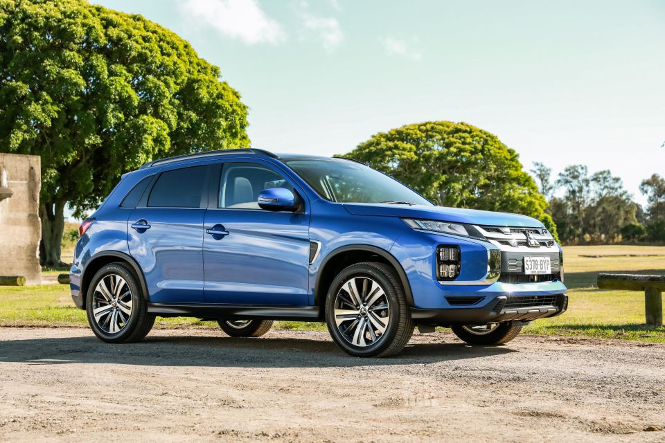
For example, companies in the Mitsubishi keiretsu (including the car brand) share the famous Three Diamond Mark. In Australia, this is why Mitsubishi Motors shares its logo with Mitsubishi Electric and Mitsubishi Heavy Industries, both of which sell other goods such as air-conditioners.
What this means is that while each brand is a distinct entity with its own history and purported brand values, often the emblem also serves as a corporate ‘family crest’ symbolically representing membership of a wider, loosely associated corporate group.
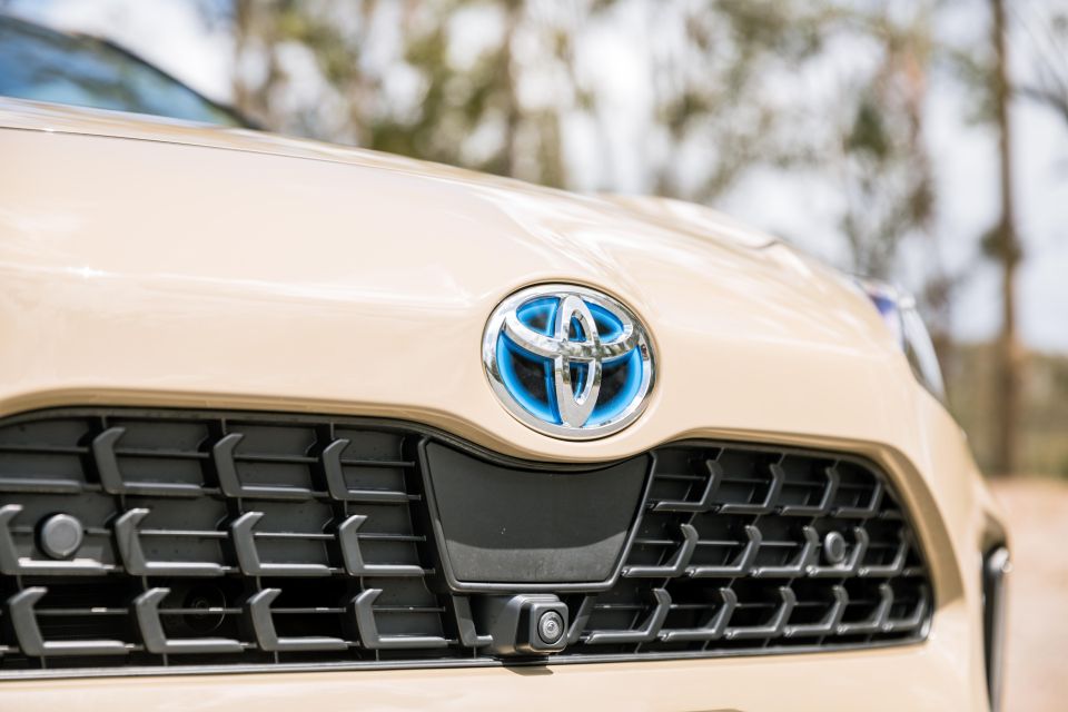
Toyota’s logo is one of the most recognisable throughout the world. At its core, however, the company’s emblem is an arrangement of three interlocking ovals with two smaller ones perpendicular to each other, contained within a larger ellipse.
The firm claims the inner ovals represent the company and the customer respectively, and that their overlapping nature is symbolic of their trust and mutually beneficial relationship.
Together with the larger ellipse encompassing the inner ovals, the logo as a whole also represents a steering wheel, signifying the company’s automotive focus. In 3D form, these ovals are also each created using varying width strokes, alluding to Japanese calligraphy and brush art.
Although the current Toyota logo also captures every letter of the brand within one emblem and was designed from the outset to be internationally recognisable, previous logos before 1989 simply referenced the Toyota name, with the original, pre-1936 logo being a blue and red diamond bearing the surname of the company’s founding family, ‘Toyoda.’
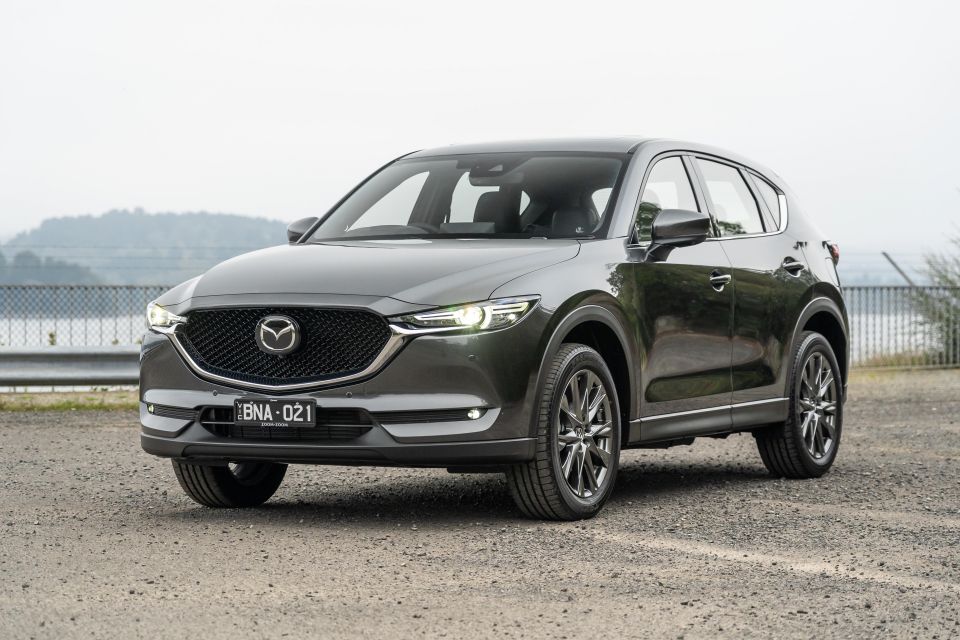
Mazda derives its name from two origins. The first is the Zoroastrian deity Ahura Mazda, who was worshipped as a god of wisdom and intelligence by the ancient Persians during the Achaemenid Empire.
The second is derived from the name of the company founder himself, namely Jujiro Matsuda – with Mazda being the anglicised pronunciation.
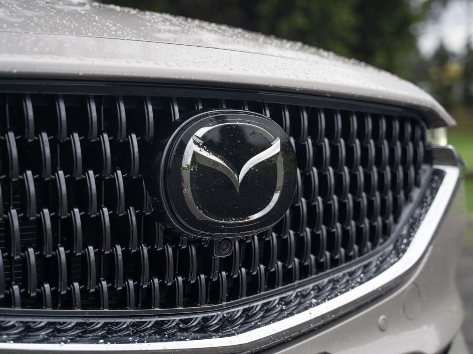
The current Mazda logo incorporates a set of stylised, V-shaped wings within what could best be described as a squircle.
The firm claims that the wings symbolise ever higher, continuous growth and improvement, whilst also representing the brand’s flexibility and creativity in coming up with new innovations, as well as its resilience to challenges.
Mazda as a company has had a long line of different logos. Perhaps two of the most famous ones are its ’30s-postwar era ‘winged M’ logo, which not only represented the river flowing through the company’s home city, Hiroshima, but could also be interpreted (much like today’s emblem) to comprise a set of wings urging the company to soar to greater success.
Hiroshima, infamously, was also the site of a nuclear attack during World War II, and perhaps understandably, Mazda replaced this symbol afterwards in 1959 with a more avant-garde design focused solely on a lower-case letter m.
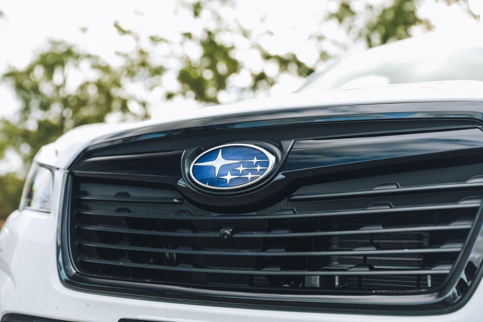
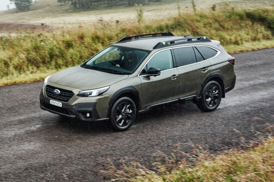
While other brands make oblique references to aviation, Subaru’s logo is perhaps the most astronomically focused. The company also retains a division dedicated to aircraft and aerospace activities.
The badge used on current Subaru vehicles not only references this heritage, but is a reminder of the firm’s corporate history.
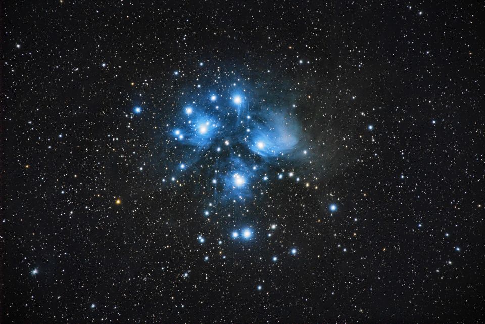
Formerly known as Fuji Heavy Industries, the company came into being in 1953 through the merger of five smaller companies, namely Omiya Fuji Kogyo (an engine manufacturer), coach and chassis builders Fuji Jidosha and Utsunomiya Sharyo respectively, scooter manufacturer Fuji Kogyo and trading firm Tokyo Fuji Sangyo.
Each of these companies is represented by a star on the emblem, whilst the larger sixth star represents the combined Fuji Heavy Industries entity.
Subaru was the first time a Japanese noun was used internationally as the name of a car brand, and fittingly, it translates to English as ‘Pleiades’, a reference to the six bright visible stars in the Pleaides cluster.
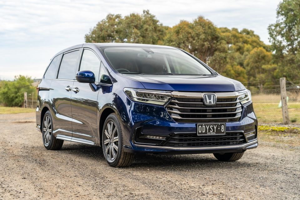
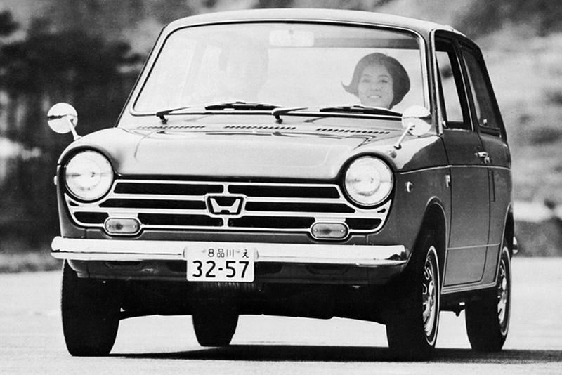
Out of all the Japanese OEMs described in this article, Honda is the only one that also has a significant involvement in motorcycles, being a leading manufacturer of bikes and scooters. Both act as separate divisions of the same company and have their own distinct emblems.
Honda was incorporated in 1948 by founder Soichiro Honda, and the company’s initial products were in the motorcycle space. Legend has it that Soichiro found a sculpture of the ancient Greek goddess of victory, Nike, and, inspired by her characteristic wings, adapted this into the wings used as part of the Honda motorcycles logo today.
This ostensibly symbolised the view that the company could always achieve what it meant out to do.
The company’s automotive logo is a less elaborate, stylised ‘H’, and this is perhaps a reflection of its more utilitarian origins.
Honda started making cars in 1963, some 15 years after producing its first bike, and Soichiro knew early on that the exporting cars would be critical to the success of the company.
Thus, he aimed to create a simple, bold logo that would be immediately identifiable as a ‘Honda’, and also translate well across different types of media and be easy to print and reproduce.
Honda’s logo uses the typical black, silver and red palette. Common in the automotive industry, these colours ostensibly represent the power and emotion imbued in their cars.
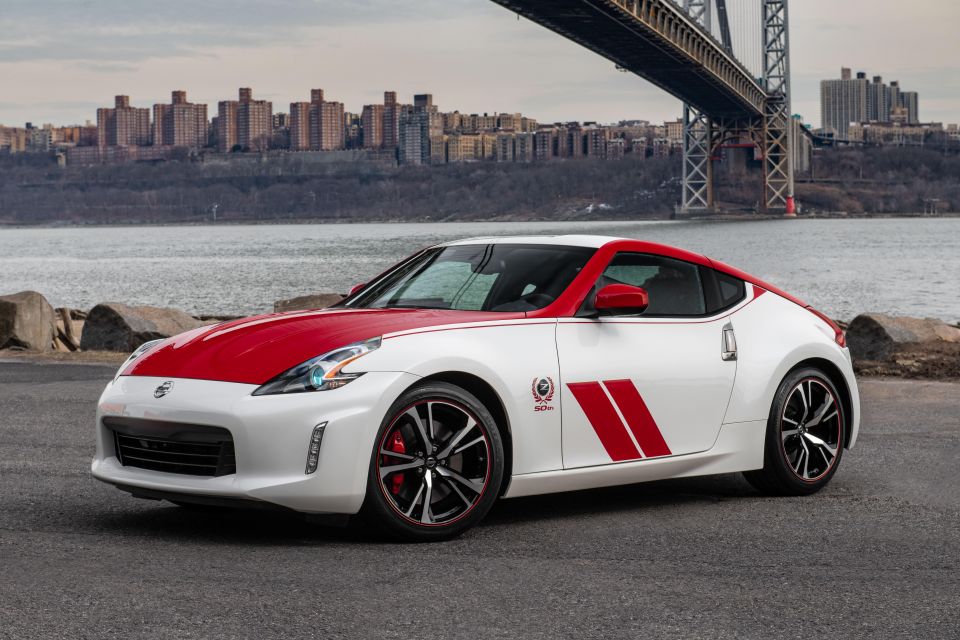
Alongside Honda and Toyota, Nissan forms part of the Big 3 Japanese automotive OEMs, and today, as part of the Renault-Nissan-Mitsubishi Alliance, forms one of the world’s largest carmakers globally.
Nissan, a shortened form of ‘Nihon Sangyo’ (translating to ‘Japan Industries’) was formed in 1933 as a holding company to take over DAT, which had been producing a car known as the Datsun since 1911. Instead of exporting cars with the Nissan name, the firm continued using the Datsun moniker well into the 1980s, before rebranding all of its products under the parent company’s brand.
Thus, Nissan produced products have used a variety of different logos, with certain models adopting a simple ‘Nissan’ or ‘Datsun’ nameplate without any additional features.
One of the most iconic Nissan/Datsun logos, however, remains the Nissan/Datsun text on a rectangular blue background overlapping a red disc. The firm claims that the red disc harkens back to the company’s Japanese origins, representing The Land of the Rising Sun, and the blue referring to the sky.
According to a Nissan executive, the logo represents one of the guiding principles of the company, namely that “If you have a strong, determined belief, it can even penetrate the sun.”
Recently, the company has unveiled a new logo with a flat design and thin lines, in line with current styling trends and designed to herald in a new era where electrification and digitalisation is increasingly prominent.
One of the first cars to feature this logo will be the new Ariya electric vehicle.
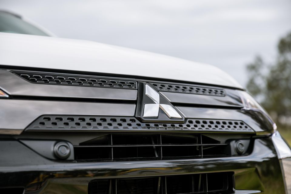
With a variety of companies in the Mitsubishi keiretsu, all in different industries but sharing similar names and a common logo, the firm’s ‘Three Diamond Mark’ could be the most widely recognised and iconic emblem here.
The origins of the logo date all the way back to the latter parts of the 19th Century, to the founder of the first Mitsubishi business, Iwasaki Yataro. Yataro coined the amalgamated name ‘Mitsubishi’ by combining the words ‘Mitsu’, a reference to the three oak-leaved crest of the Yamauchi clan, with ‘Hishi’, referring to the three-tiered water chestnut crest of the Iwasaki clan.
With a trademark first registered in 1914, the Mitsubishi logo has remained largely unchanged since, and is not only the oldest logo here, but perhaps one of the oldest logos still used in the automotive industry.
With the logo being used by myriad companies, all in very different industries, there is no elaborate, automotive-specific story behind the branding. Instead, the consistency with which the logo has been used should perhaps be construed as a reference to the quality and reliability that the marque prides itself in.
CarExpert
3 Hours Ago


Dave Kavermann
3 Hours Ago


Damion Smy
4 Hours Ago
Damion Smy
5 Hours Ago

William Stopford
6 Hours Ago
William Stopford
7 Hours Ago
Add CarExpert as a Preferred Source on Google so your search results prioritise writing by actual experts, not AI.